New Content Filters
Redesigning the filter panel in a headless CMS to reclaim screen real estate for thousands of content items.
Context
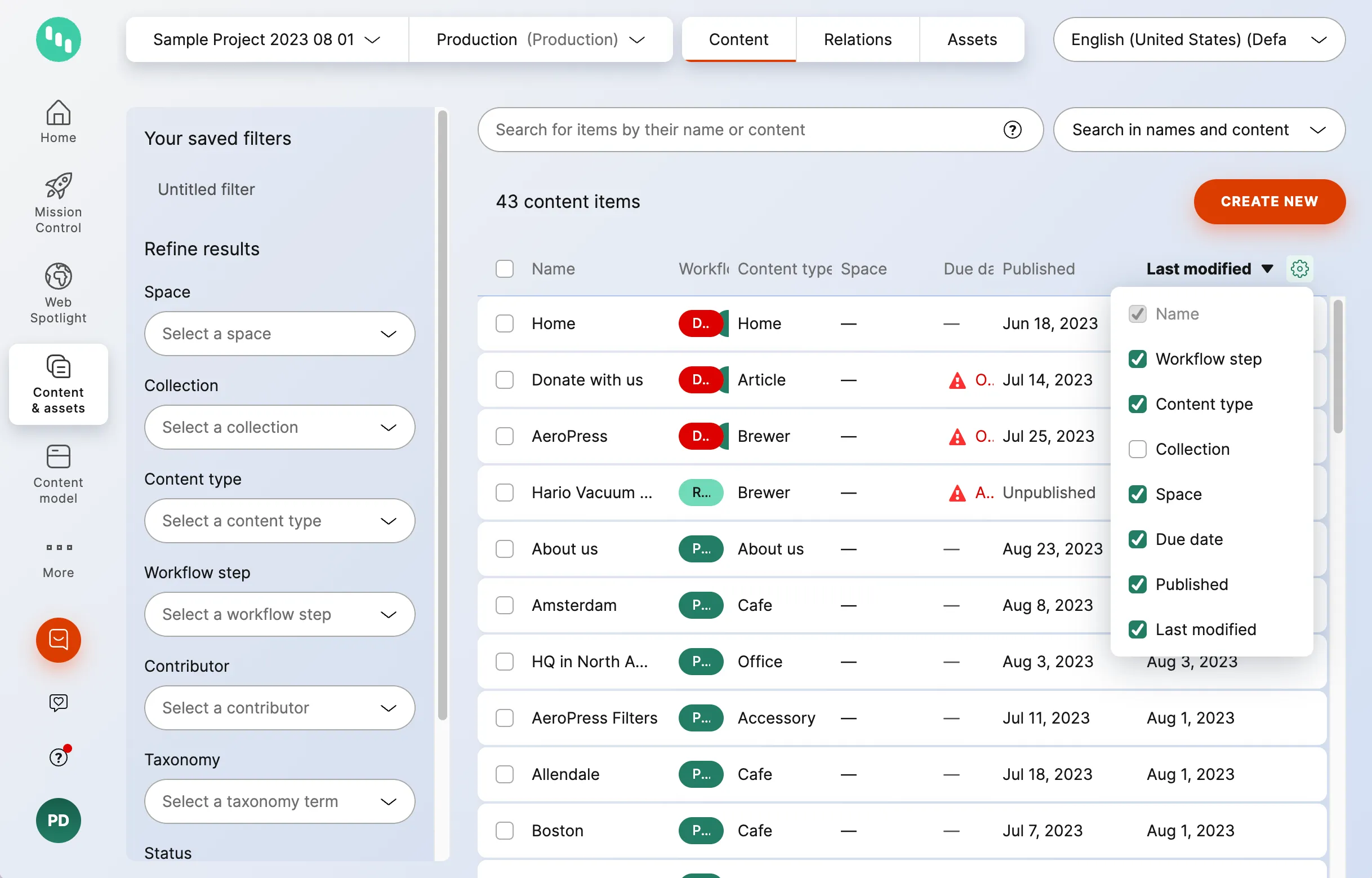
Kontent.ai is a headless CMS where large enterprise customers manage thousands – sometimes millions – of content items. Content is viewable in a customisable, sortable table with a search field and a left-side filter panel.
Over years of incremental development, multiple columns were added to the table. Large customers need most of those columns visible at once. Hiding columns doesn’t solve the problem because the data is genuinely useful.
On top of that:
- Around 10% of traffic comes from iPad.
- A significant portion of users run the app side-by-side with other tools (recommended in the docs).
- The filter panel consumed significant screen real estate on the left.
- Content item names were truncated – customers were vocal about it in ProductBoard feedback.
Problem
The content inventory felt cramped. Users couldn’t see enough of their content at once, and the persistent filter panel was the biggest contributing factor.
The goals:
- Significantly improve available space for content viewing.
- Users successfully locate and understand the new expandable filters.
- Maintain or improve efficiency and accuracy of content selection.
Process
I worked closely with the Product Manager on problem definition and goals, then moved through several stages:
- Brainstorming – multiple solution directions explored with colleagues across roles.
- Developer consultation – early technical feasibility checks before investing in detailed design.
- Design review – fellow designers reviewed concepts to surface issues early.
- Prototype testing – remote usability testing on a Figma prototype.
The standard design review process ran in parallel throughout.
Solutions explored
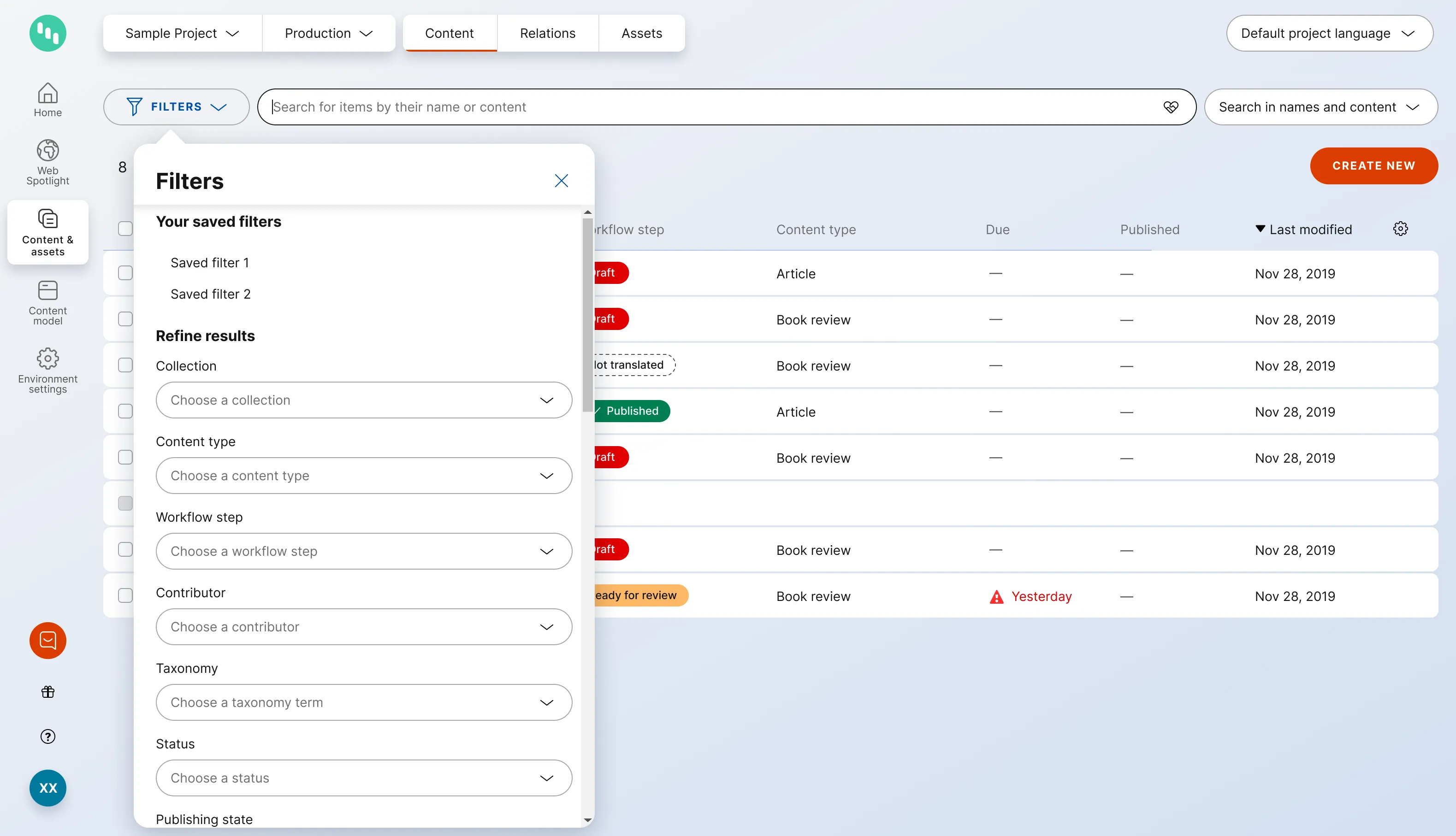
Discarded: popup from a button
The first direction was a standard popup/popover triggered by a filter button. It’s the conventional pattern and users would recognise it immediately.
The problem: the popup always obscured some content during the iterative filtering process. Users would open filters, make a selection, then need to close the popup to see what changed – then reopen it to refine. That back-and-forth negated the benefit.
Implemented: expandable horizontal filter panel
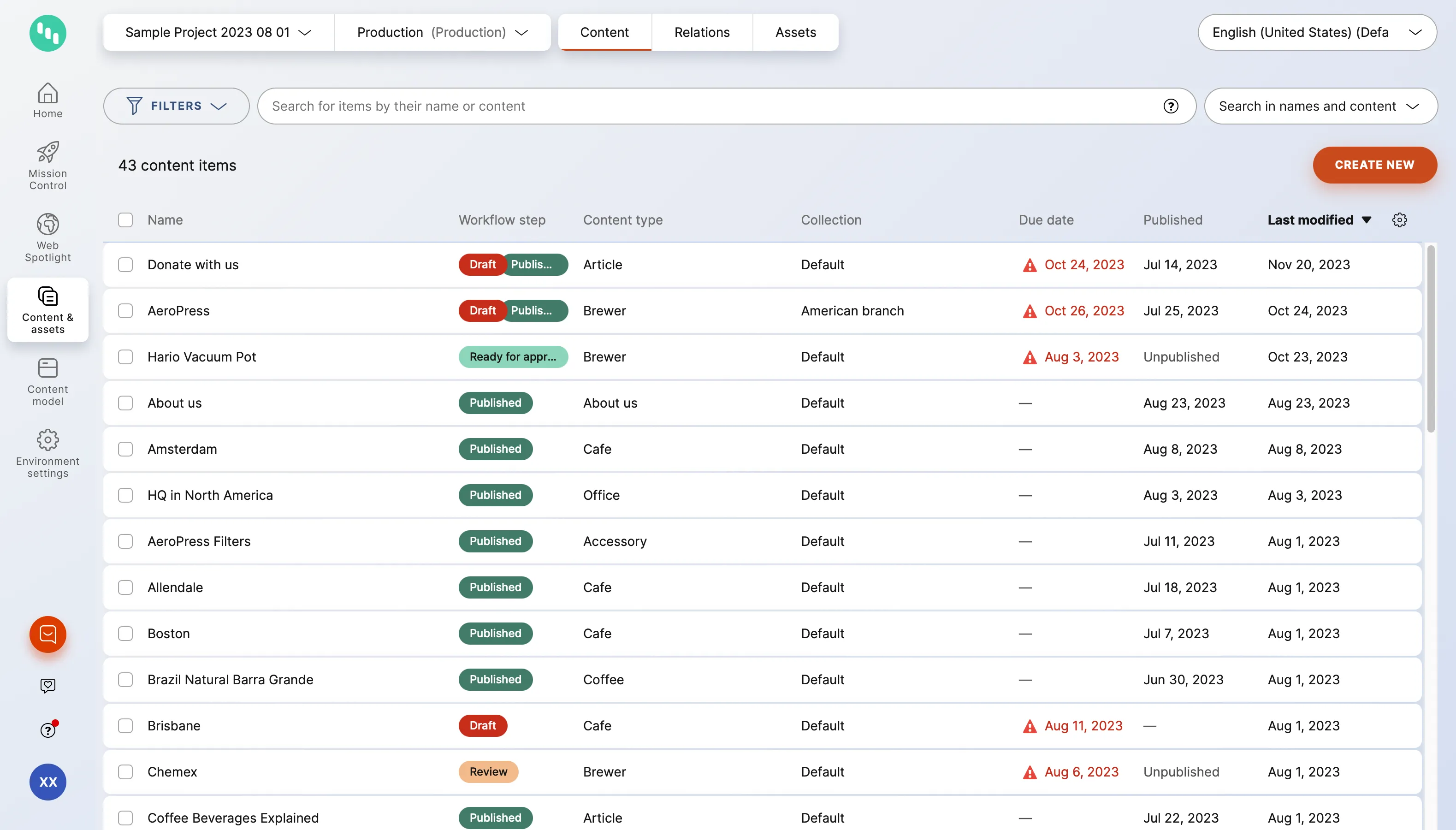
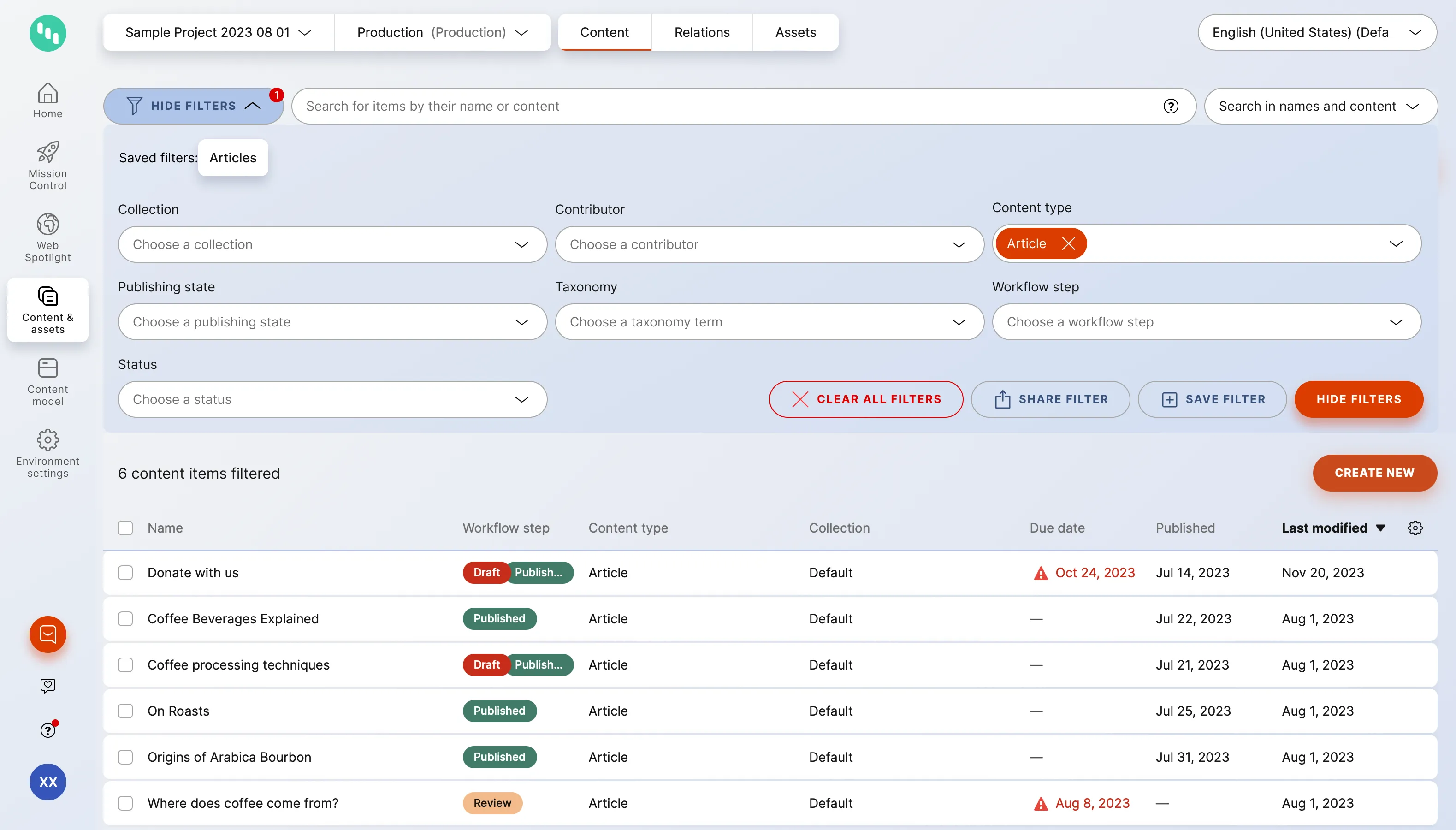
An unconventional approach – instead of a persistent left panel or a floating popup, the filter panel expands horizontally from the top of the table, above the content rows.
When collapsed, users see only a slim filter bar. When expanded, the filters appear in a row above the table. The table content is still visible below – users can see their initial results and scroll to see more while refining filters.
Key behaviours:
- Filters remain accessible without obscuring results.
- Saved filters persist after collapsing the panel.
- Visual indicator shows when filters are active.
Usability testing
I ran remote prototype testing with 5 participants – handpicked from the research pool to match suitable personas (large-customer content editors and administrators).
Testing used a Figma prototype. I wrote the research script and conducted the sessions. Findings were processed in Condens.
Key findings:
- The new approach was perceived as better – users appreciated that content stayed visible.
- A badge showing the number of active filters was confusing – it looked like a notification.
- Saved filters should remain visible after collapsing the panel (not hidden until reopened).
- No second round of testing needed – issues were minor and the solution direction was validated.
Design decisions based on findings
Removed: numeric badge on the filter button.
Added: highlighted text in the filter bar showing what’s currently filtered – clearer, less ambiguous.
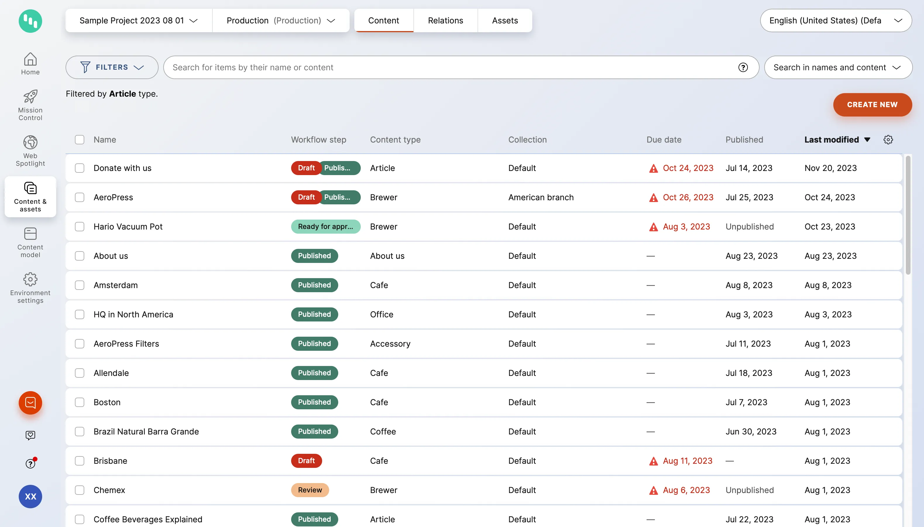
Ensured: saved filters remain visible when the panel is collapsed, so users can see their active filter set at a glance.
Outcome
The feature shipped to all users in mid-2025 as part of a broader navigation redesign. On a typical laptop, collapsing the filters frees roughly a third of the screen for the table.
Post-launch feedback did its job. It confirmed the core bet – content stays visible while filtering. It also surfaced friction in one workflow: teams that keep all their content in a single collection and filter constantly, and for them the collapsed-by-default bar adds a step on every visit. On short browser windows the expanded panel can cover the results entirely.
For now, we logged the friction as design debt rather than iterating – a few reports, with saved filters already covering the workflow, didn’t justify pulling the team back.
The pattern outgrew its original screen – the same expandable filter bar now serves the asset library and audit log.